ion-item
项目是元素,可以包含文本、图标、头像、图像、输入以及任何其他原生或自定义元素。项目应该仅用作 列表 中与其他项目一起的 行。项目可以被滑动、删除、重新排序、编辑等。
基本用法
项目文本左对齐,当文本宽度大于项目时自动换行。我们可以使用 Ionic Framework 提供的 CSS 实用程序修改这种行为,例如在以下示例中使用 .ion-text-nowrap。有关可添加到项目以转换文本的更多类的信息,请参见 CSS 实用程序文档。
内容类型
虽然列表中的项目形式多种多样,但它们通常支持 5 种不同的内容类型:支持视觉效果、文本、元数据、操作和控件。但是,不应同时使用所有这些内容类型。以下指南展示了不同的内容类型以及如何在应用程序中正确使用它们。
支持视觉效果
支持视觉效果是项目的装饰性图标或其他装饰。常见的支持视觉效果示例是 头像、图标 和 缩略图。由于此内容不是理解项目意图所必需的,因此它通常使用 aria-hidden="true" 从屏幕阅读器中隐藏。
如果视觉效果需要与项目交互,例如图标按钮,那么视觉效果就是 操作,而不是支持视觉效果。
支持视觉效果应以一致的方式呈现。这使得每个项目中的信息更容易解析。
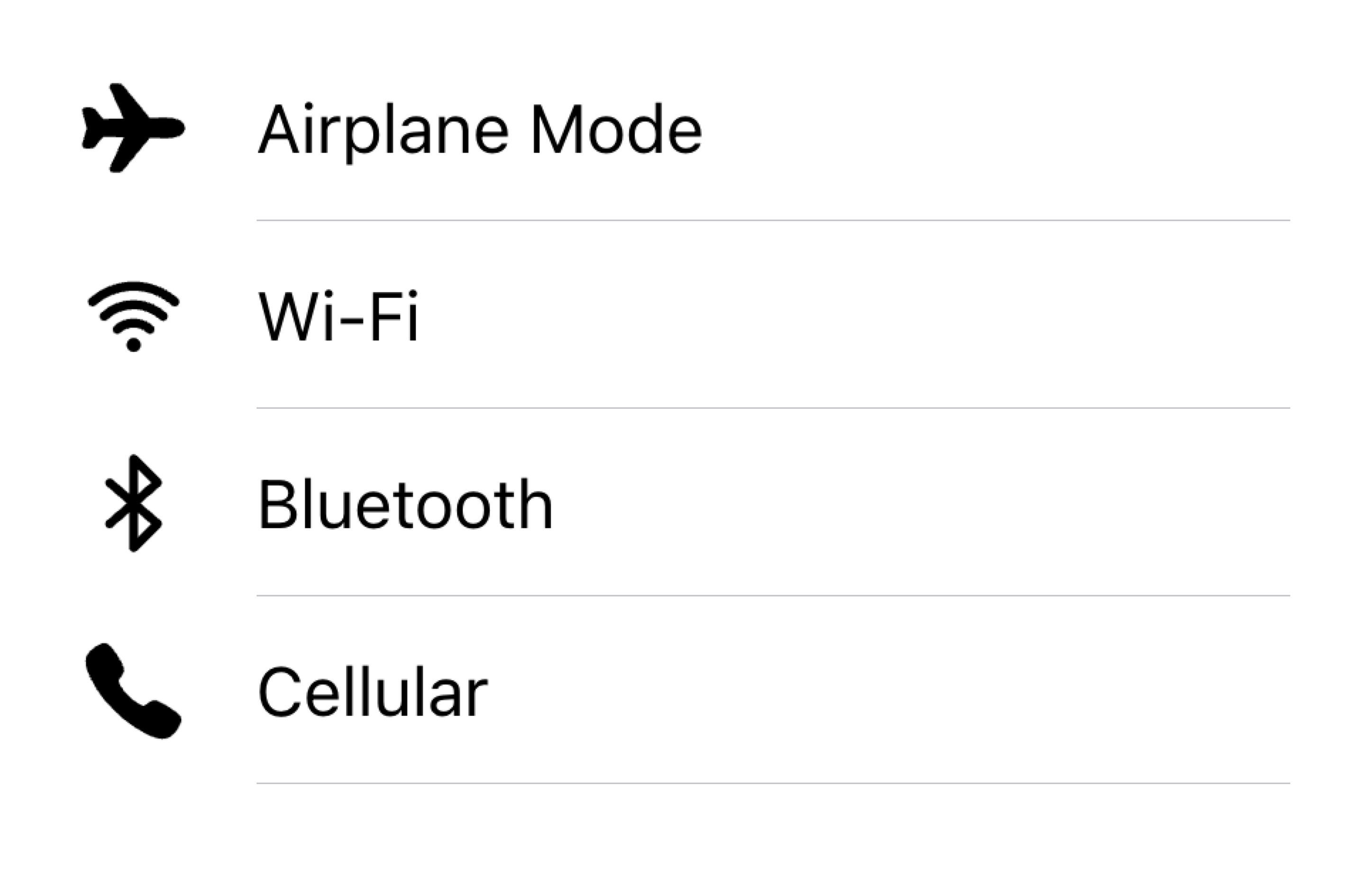
在列表中将视觉效果对齐到同一侧
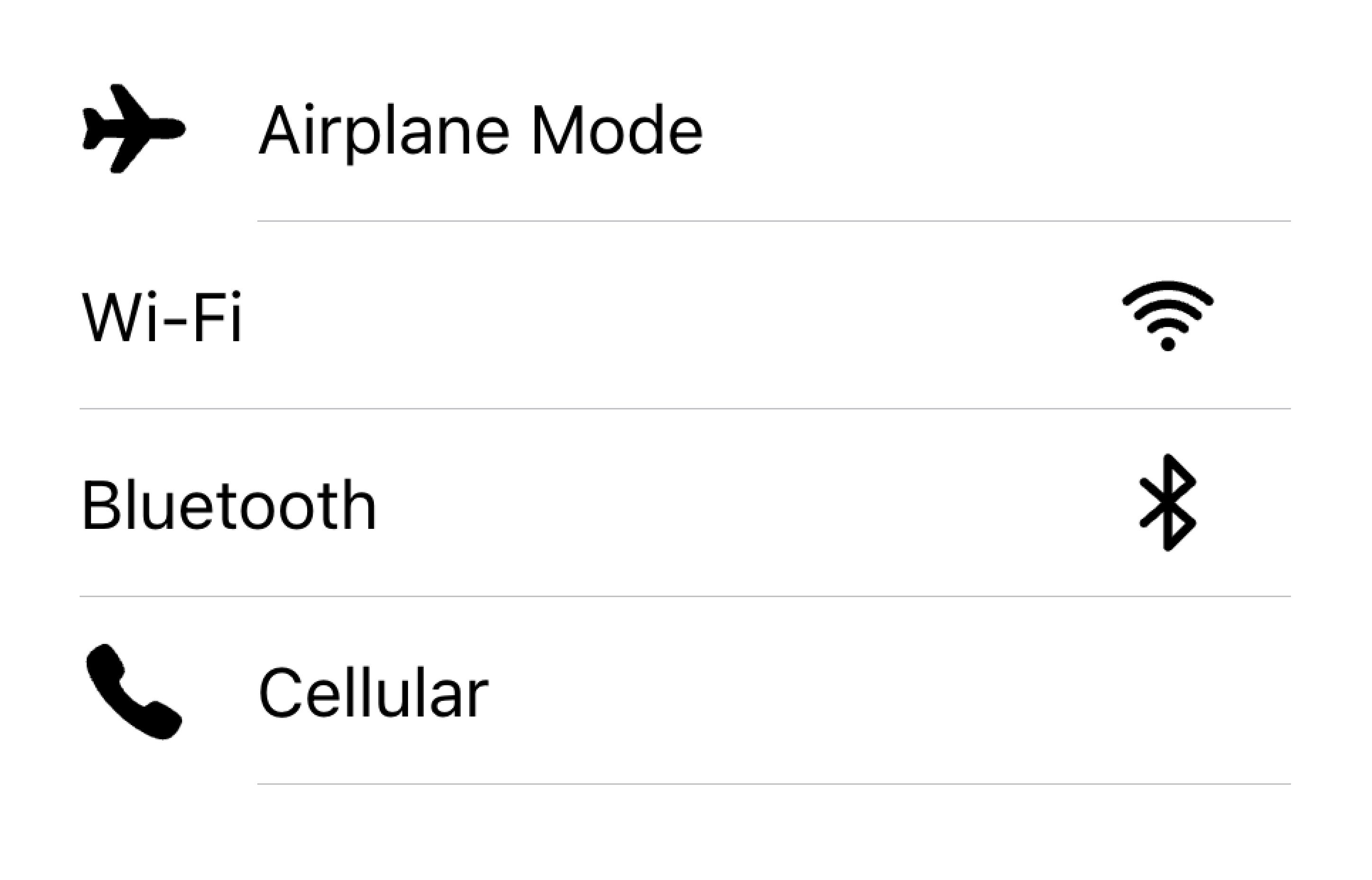
不要在同一列表中呈现具有不同对齐方式的视觉效果
在下面的示例中,我们创建了两个带有支持视觉效果的列表。第一个列表使用图标,第二个列表使用头像。视觉效果是装饰性的,因此它们都具有 aria-hidden="true"。此外,它们在 start 槽中一致地呈现。
文本
文本内容类型包括表单控件标签或其他可见文本。此文本用于指示项目的意图。尝试使文本简短明了。
如果您发现需要更多句子来阐明项目的用途,请考虑将这些句子移到列表底部的 备注 中。将项目添加到其自己的列表中可以清楚地表明文本与哪个项目相关联。
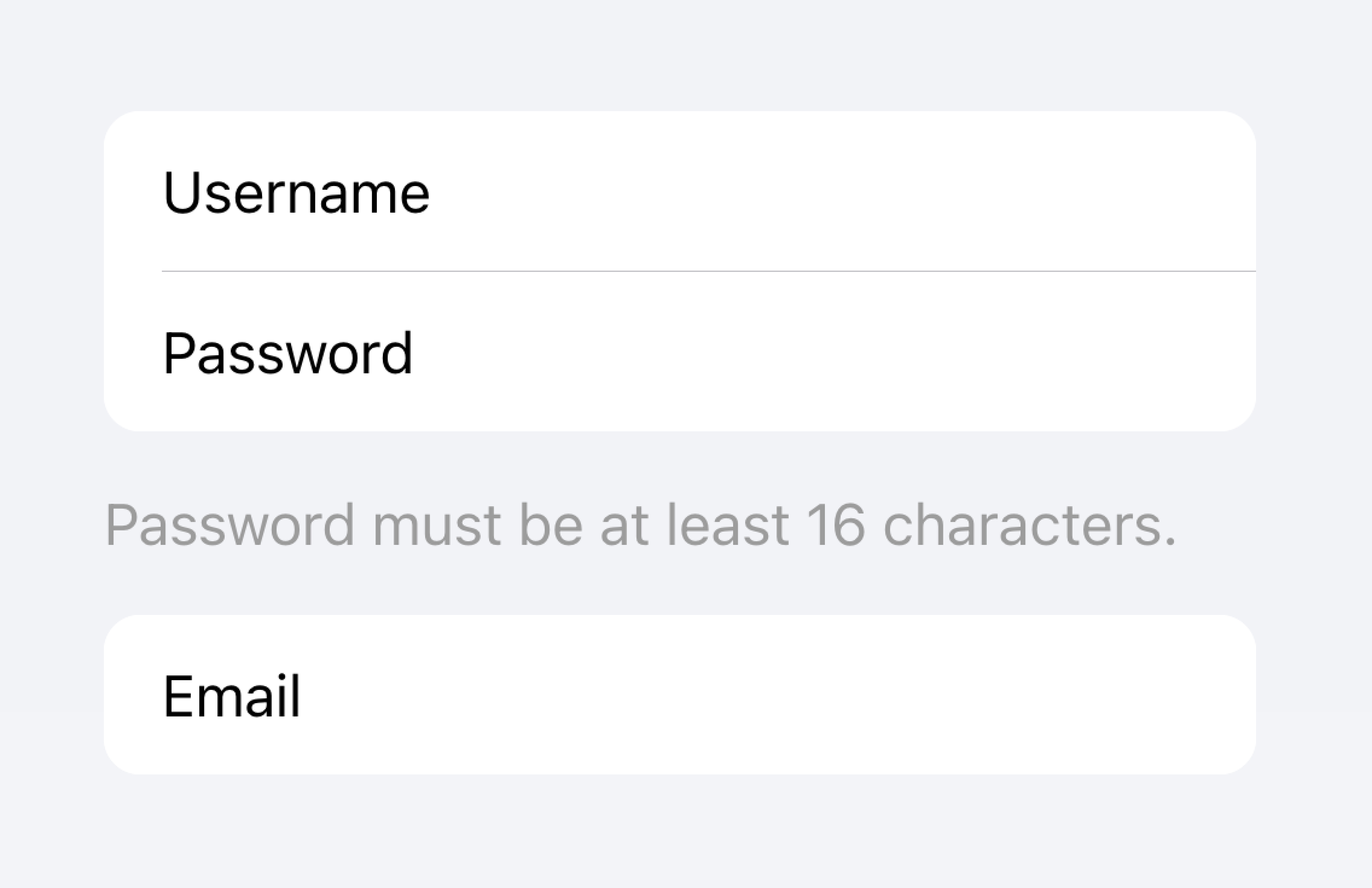
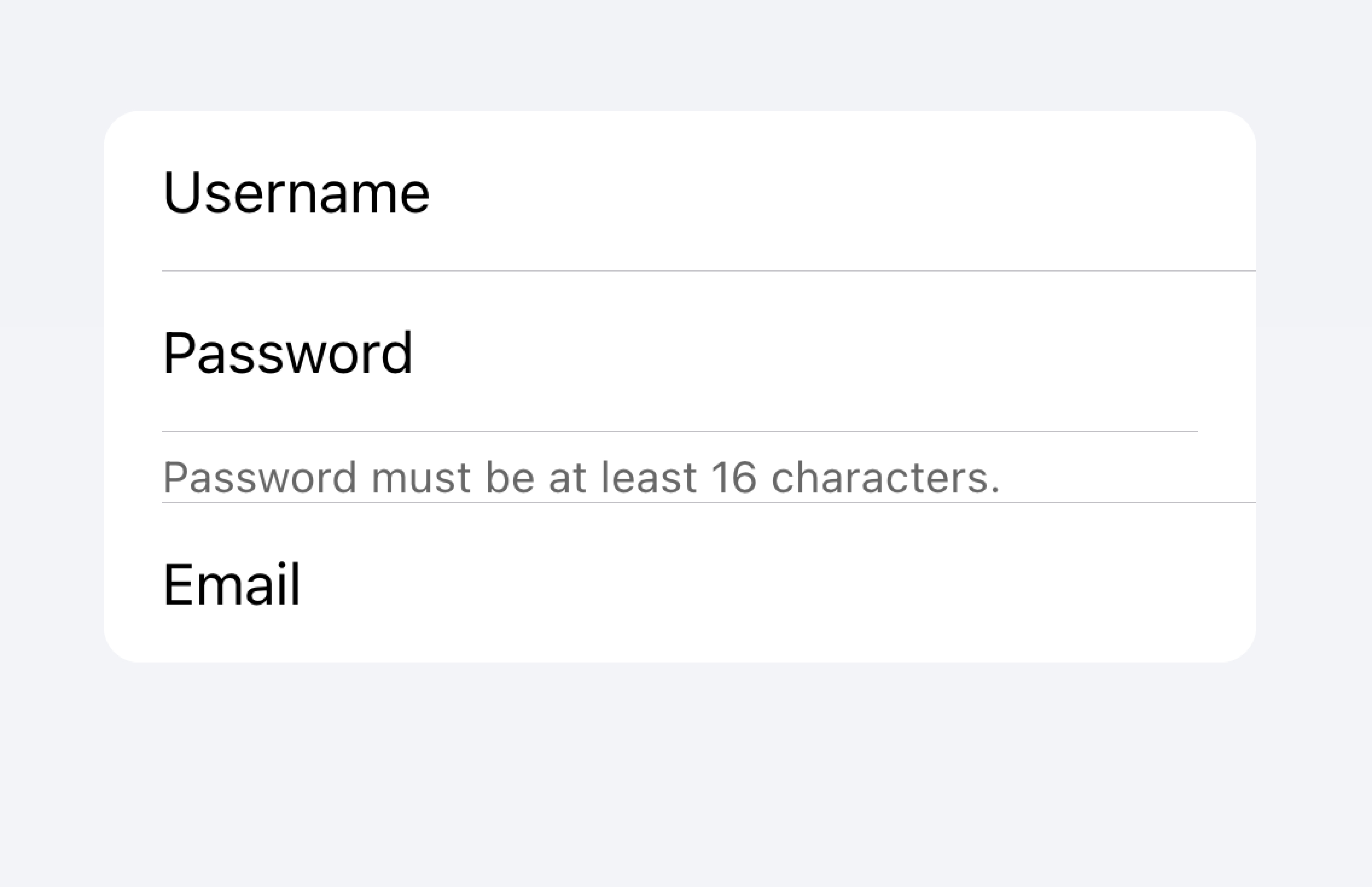
将长文本移到列表之外
不要尝试将长文本放入项目中
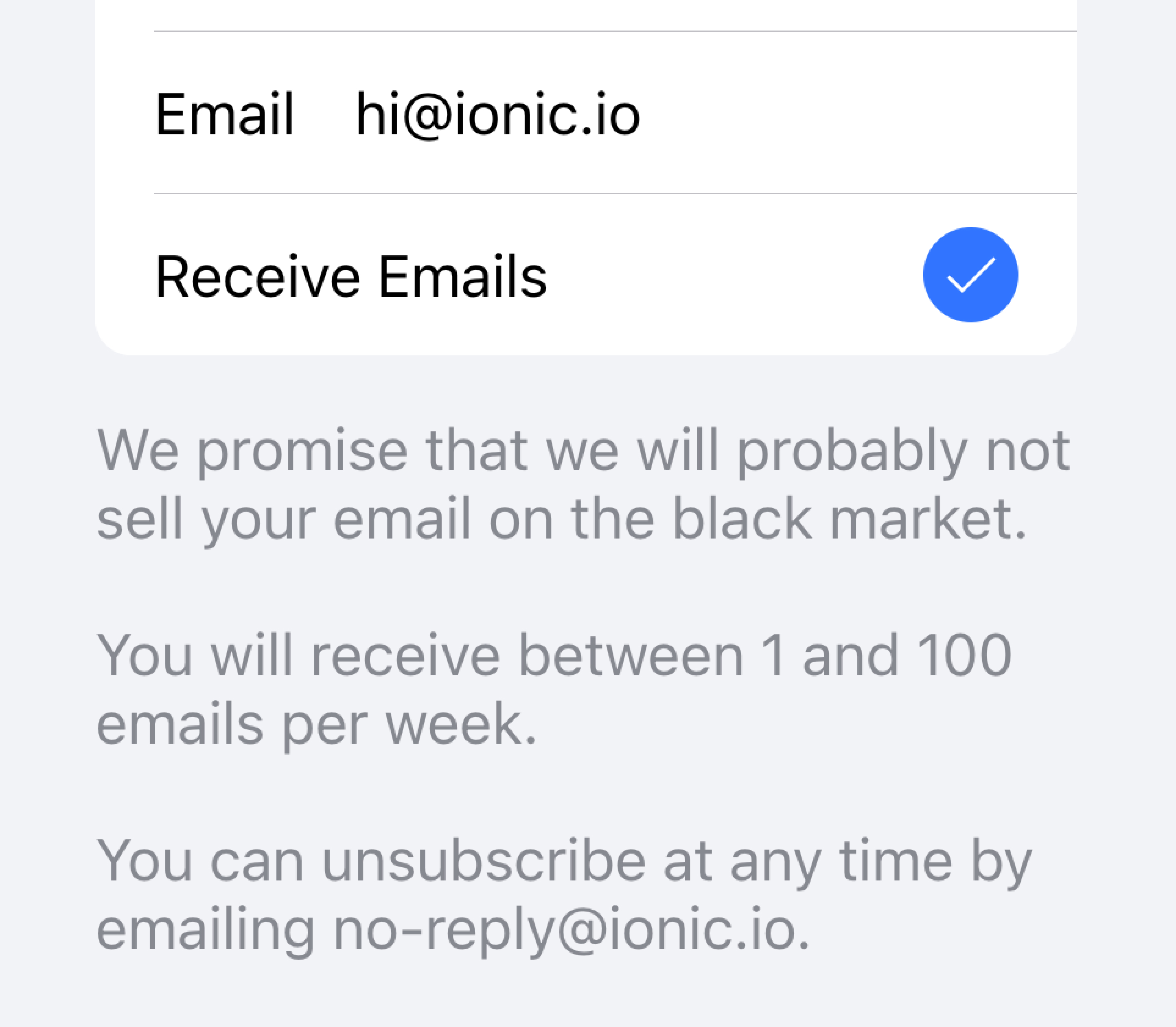
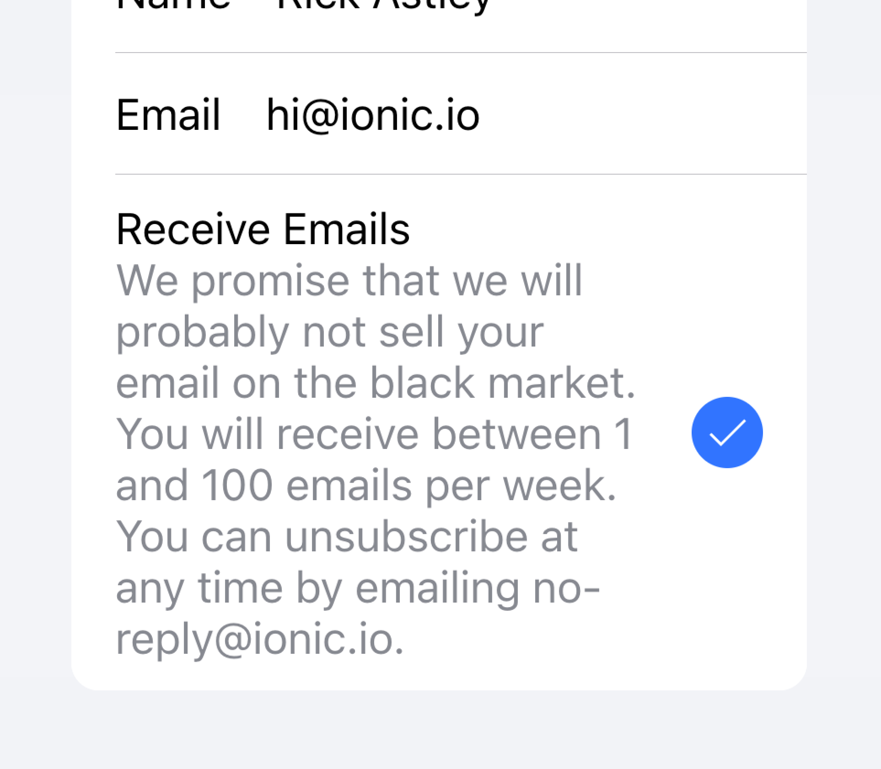
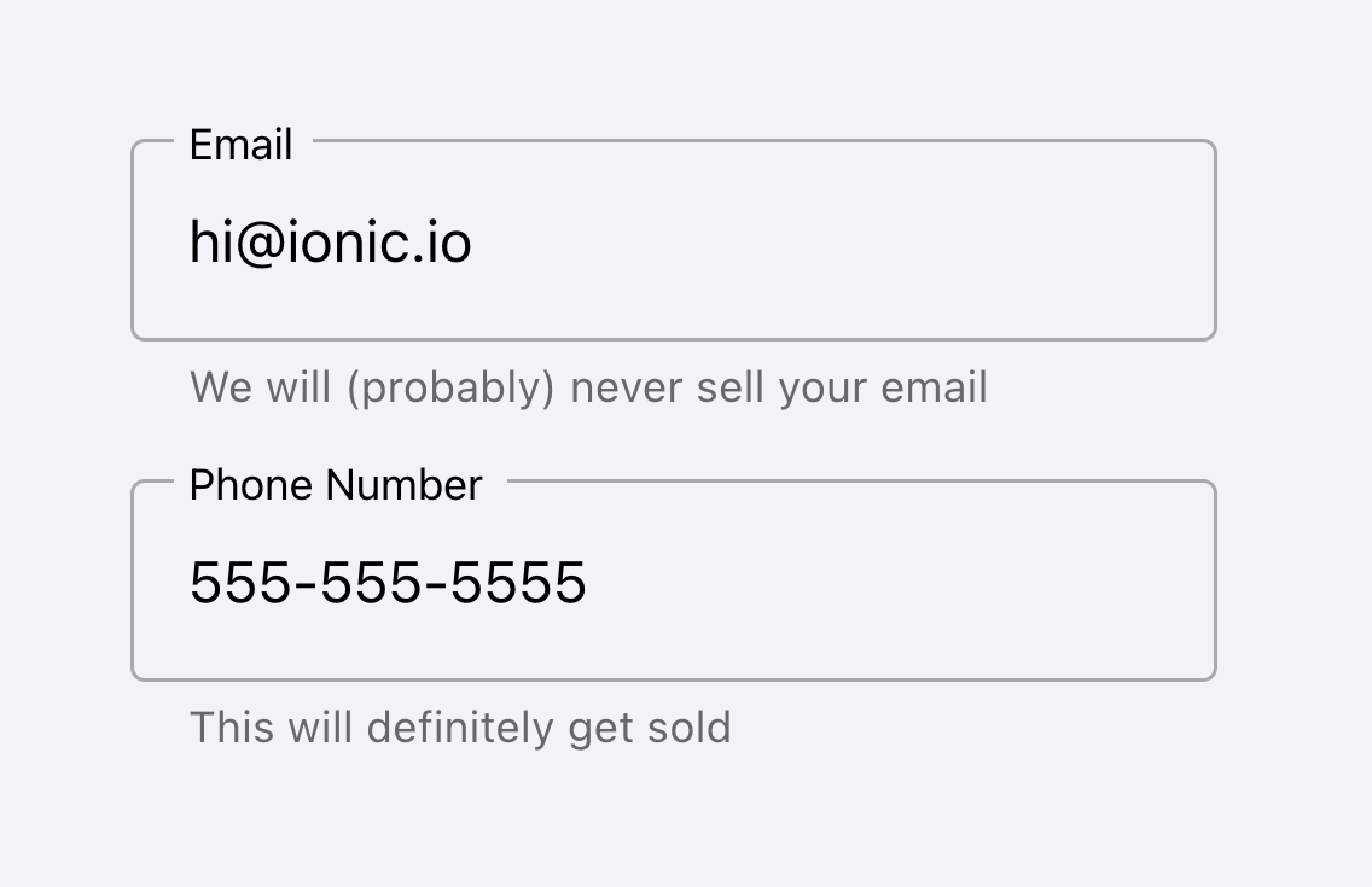
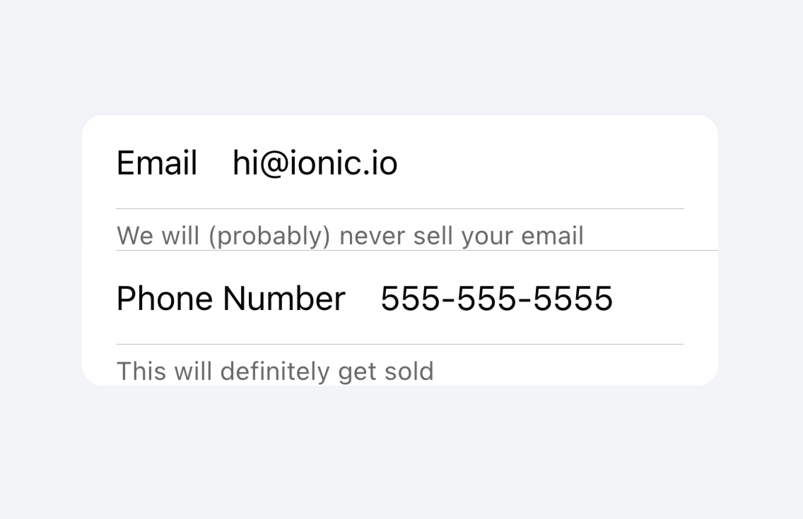
在下面的示例中,我们创建了一个包含不同类型文本的列表。"姓氏" 和 "名字" 标签用于指示在文本输入框中输入的内容。
切换按钮上的 "允许通知" 标签下面有额外的文本,说明用户可以禁用通知。由于此文本很短,因此它放置在项目内。
在该列表下面是另一个列表,其中包含一个带有 备注 的文本区域,该备注包含在其下方的大量文本。文本区域被放置在其自己的列表中,以便清楚地表明长文本与文本区域相关联,而不是与任何其他字段相关联。
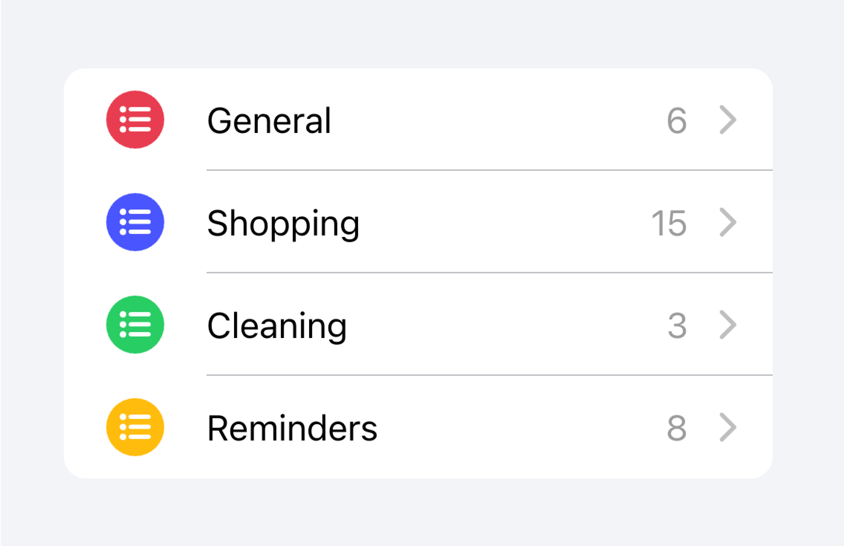
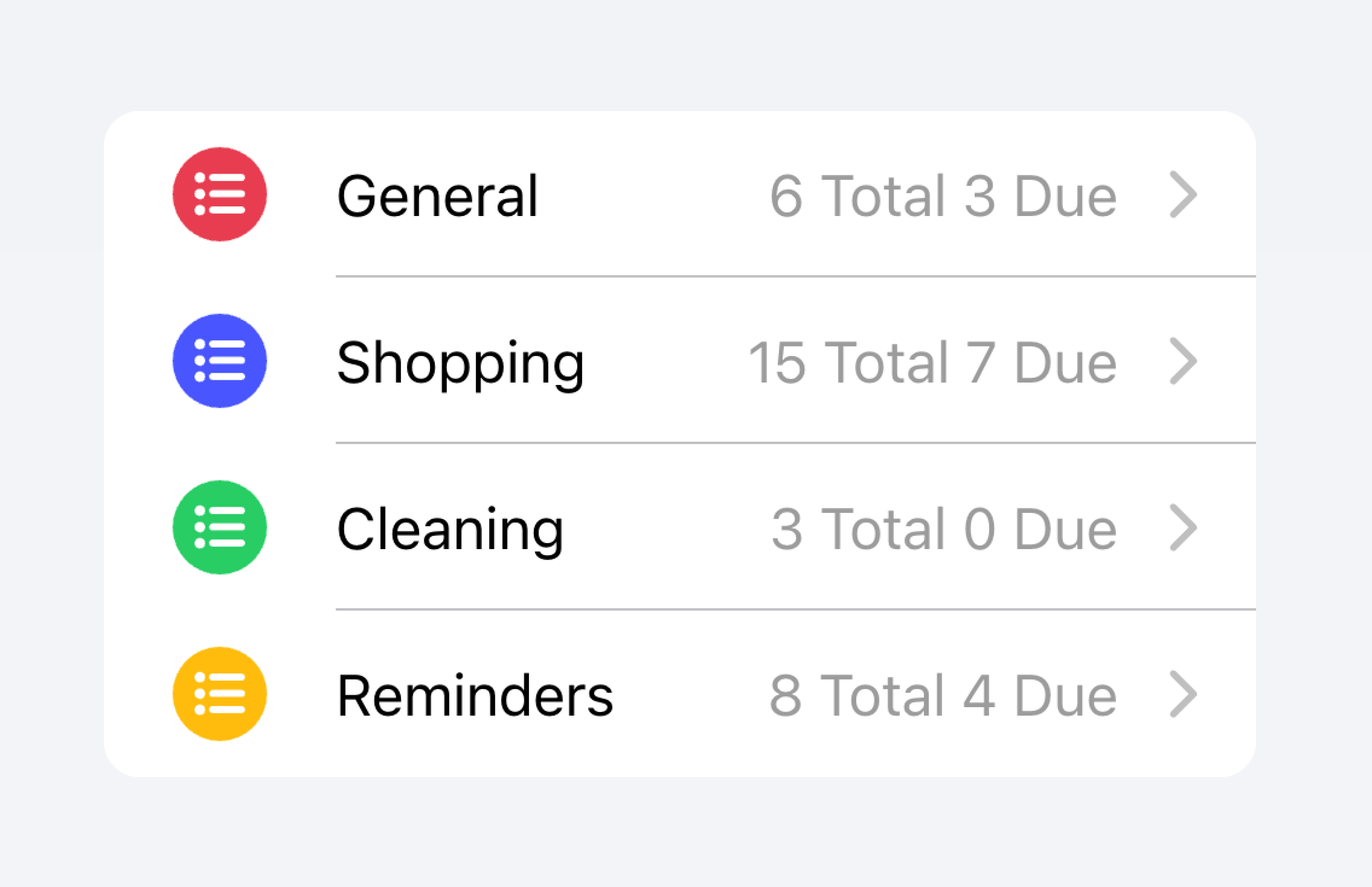
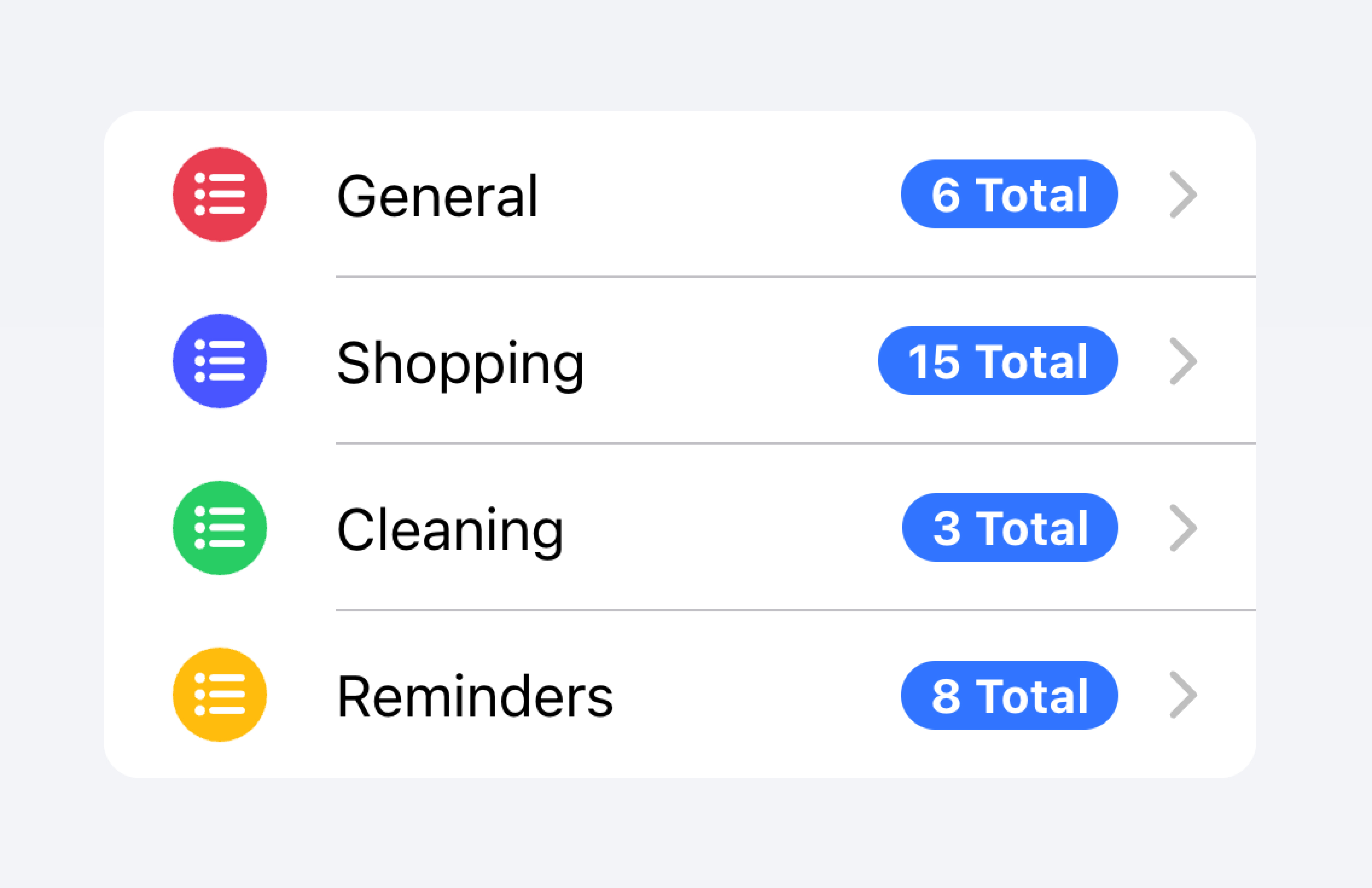
元数据
元数据为项目提供额外的上下文,例如状态文本或计数。像 徽章 或 备注 这样的组件是显示元数据的绝佳方式。
将包含的元数据数量限制为最相关的信息。
仅添加最重要的元数据
不要添加太多元数据,因为这可能会压倒或混淆用户。
开发人员还应考虑元数据的重要性。根据用例的不同,突出显示元数据可能对用户有帮助,或者它可能会分散他们对更重要信息的注意力。
优先考虑最重要的内容。
优先考虑的元数据可能会分散对其他重要内容的注意力。
在下面的示例中,我们创建了两个包含不同类型元数据的列表。第一个列表使用 备注 来显示每个待办事项列表中有多少个任务。
第二个列表模仿 iOS 邮件应用程序以显示收件箱。此列表使用自定义元数据,包括 "未读消息" 指示器(在 "start" 槽中),以及 "end" 槽中的时间戳和自定义详细信息图标。"未读消息" 指示器以蓝色突出显示,以将用户的注意力吸引到未读消息上,而时间戳则更加微妙。
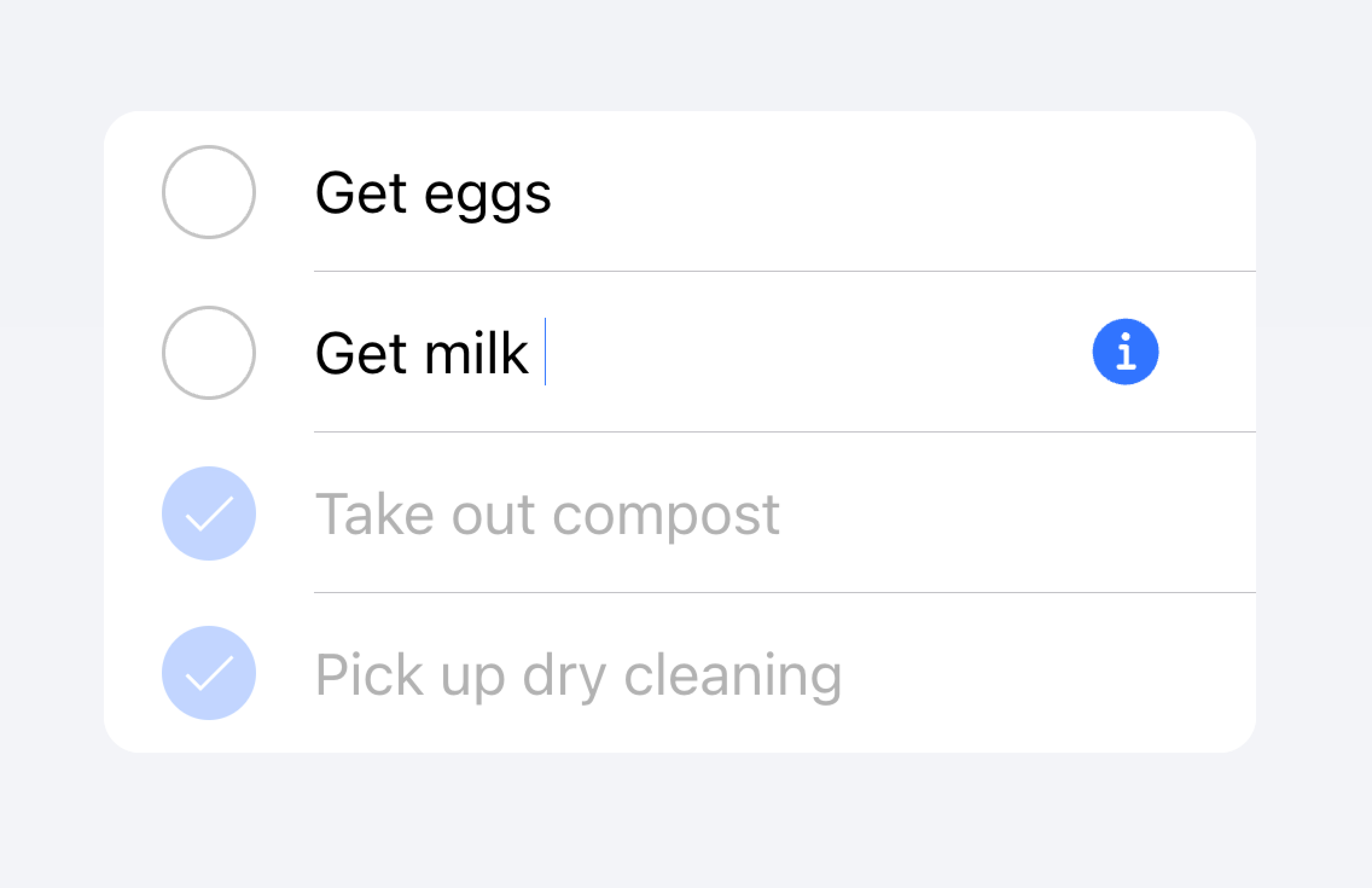
操作
操作是交互式元素,在您激活它们时会执行某些操作。一个项目可以在一行上显示多个操作。但是,开发人员应确保每个操作的点击目标足够大,以便可以使用。
开发人员应避免创建 嵌套交互,这可能会破坏屏幕阅读器对用户体验的影响。例如,如果 button 属性设置为 true,开发人员应避免在项目的“主要内容”内添加按钮。
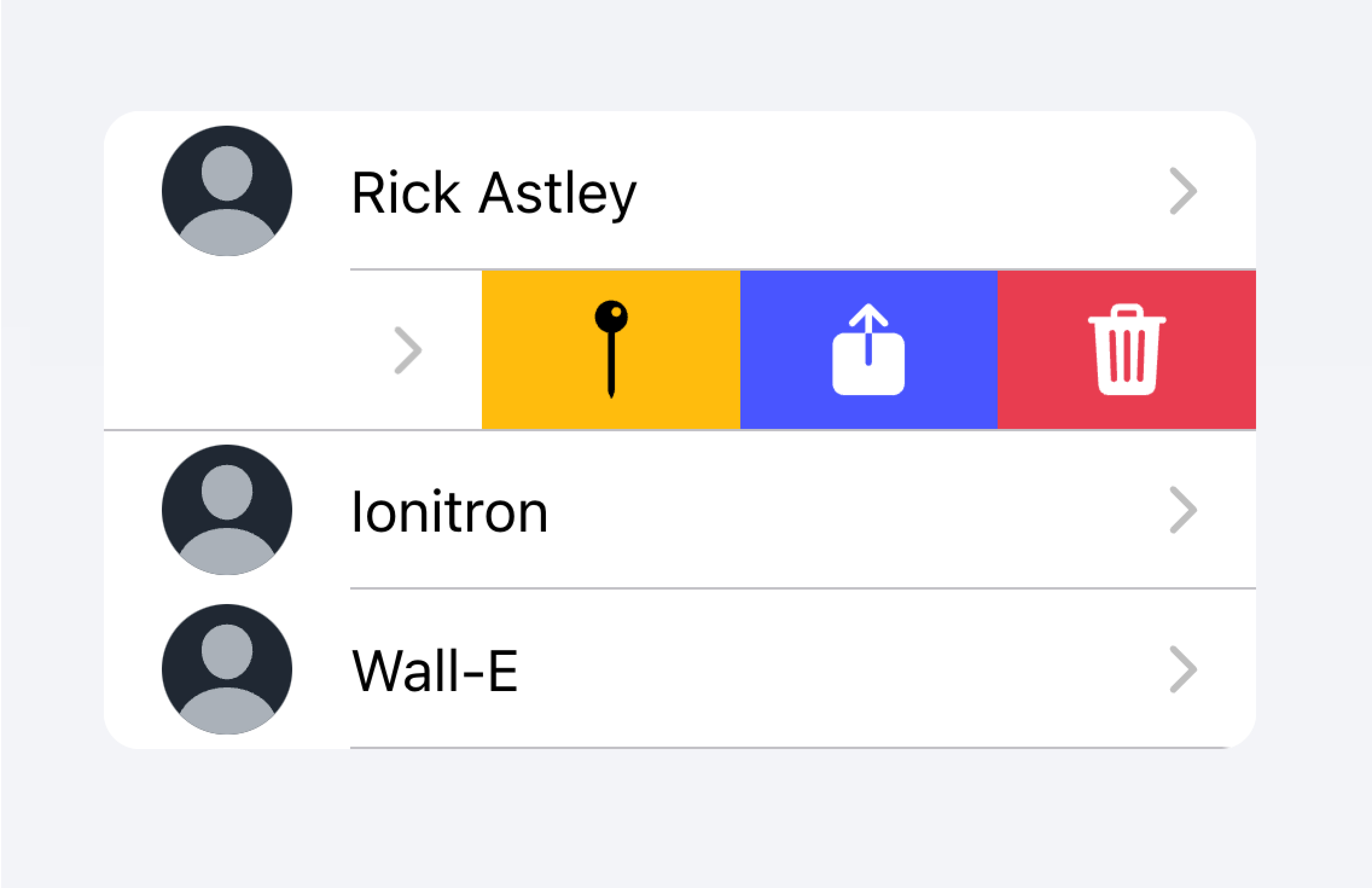
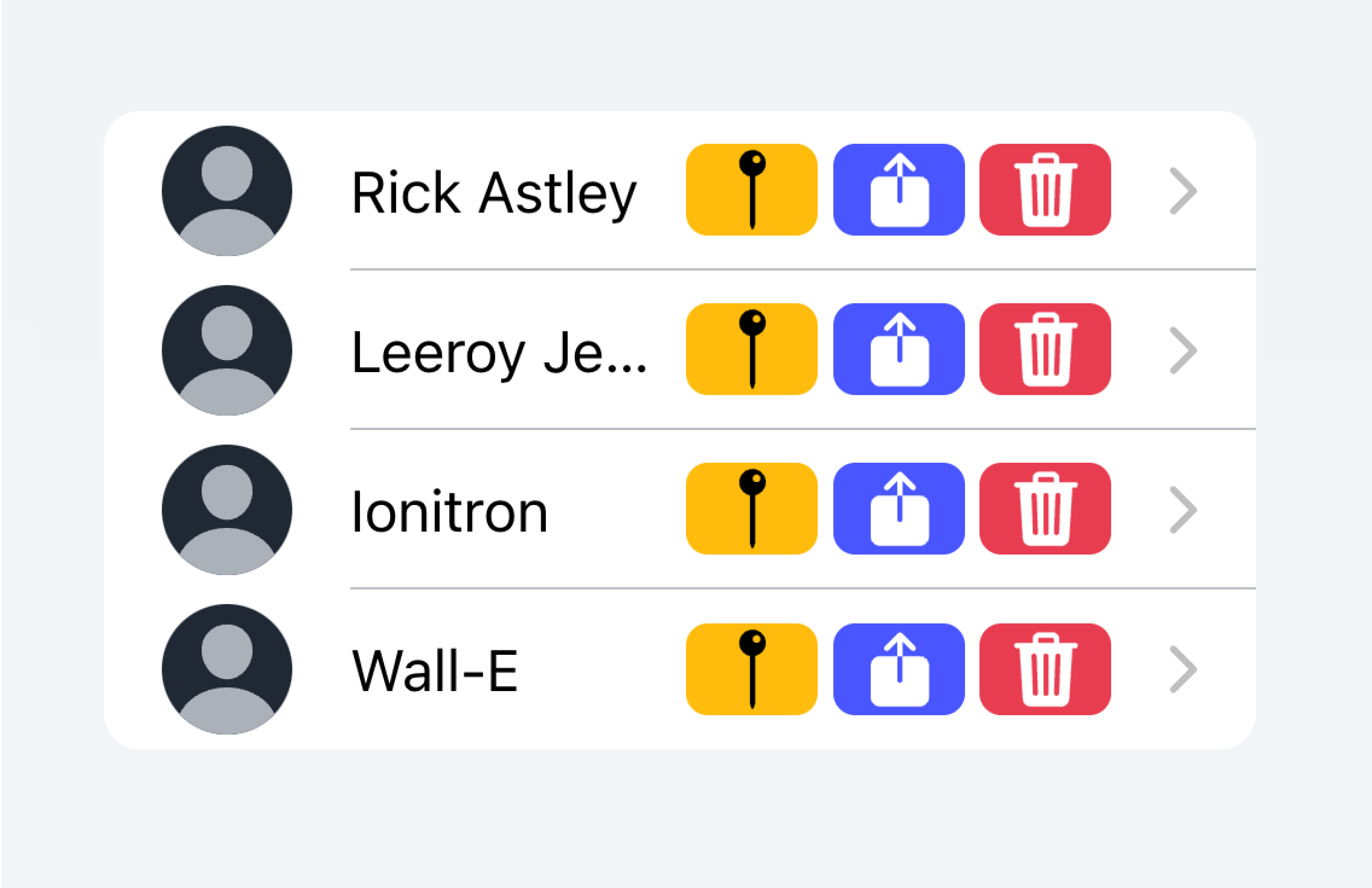
在下面的示例中,我们创建了一个联系人列表。每个项目都是一个存根按钮,旨在将您带到该项目的完整联系人页面。每个项目都与其他操作相关联,用户可以通过滑动项目来显示这些操作。
控件
控件是表单组件,例如复选框、输入框、单选按钮等。列表中的每个项目最多应包含两个控件,因为屏幕空间有限。
像帮助文本或字符计数这样的元数据不应在列表视图中的表单控件上使用。如果需要这种元数据,则应将表单控件放置在列表之外。 填充输入 是在列表之外以视觉方式定义输入容器的绝佳方式。
将带有元数据的输入放置在列表之外。
不要将输入的元数据放在列表中。
或者,可以将元数据放置在列表底部的 备注 中。
将输入的元数据放置在列表的末尾。
不要将输入的元数据放在列表中。
项目通常不应包含超过两个控件。如果您需要更多控件,请考虑在项目可访问的 模态框 中添加其他控件。
将其他控件移到可从项目访问的子菜单中。
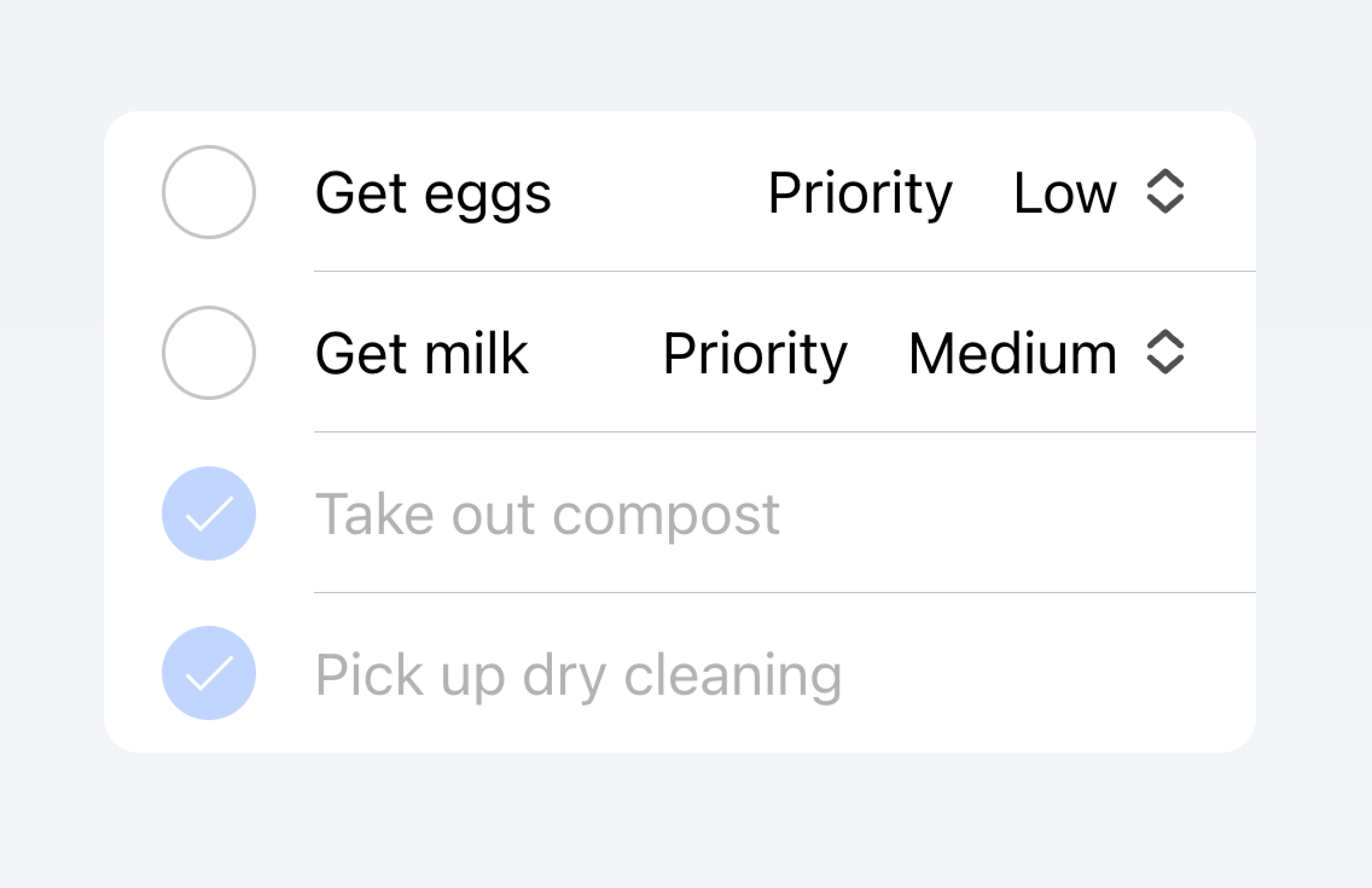
每个项目中不要使用超过两个控件。
在下面的示例中,我们正在创建待办事项列表。每个项目都有一个复选框和一个输入框。复选框允许用户将任务标记为已完成,输入框允许用户更改任务的名称。
可点击的项目
如果项目设置了href或button属性,则该项目被认为是“可点击的”。可点击的项目有一些视觉上的差异,表明它们可以进行交互。例如,可点击的项目在md模式下激活时会收到涟漪效果,在ios模式下激活时会突出显示,并且默认情况下在ios模式下有一个详细信息箭头。
详细信息箭头
默认情况下,可点击的项目会在ios模式下显示一个右箭头图标。要隐藏可点击元素上的右箭头图标,请将detail属性设置为false。要在一个默认情况下不显示右箭头图标的项目上显示右箭头图标,请将detail属性设置为true。
项目线条
项目默认情况下会显示一个内嵌的底部边框。边框在左侧有填充,并且不会出现在"start"插槽中插入的任何内容下方。lines属性可以修改为"full"或"none",分别显示全宽边框或无边框。
项目中的按钮
与项目外部相比,项目内部的按钮样式更小。要使按钮大小与项目外部的按钮大小匹配,请将size属性设置为"default"。
项目输入框
主题
颜色
CSS 阴影部分
CSS 自定义属性
指南
以下指南将有助于确保您的列表项易于理解和使用。
- 项目应该只在列表内使用。
- 列表内的项目应该以一致的格式呈现。例如,如果您的项目呈现装饰性图标,则这些图标应该在不同项目之间以相同的方式定位。
- 项目永远不应该呈现嵌套交互。当使用嵌套交互时,屏幕阅读器无法选择正确的交互元素。例如,避免将按钮放置在具有
button="true"的ion-item内。 - 正确使用内容类型。Item 组件旨在成为列表中的行,不应该用作通用容器。
可访问性
键盘交互
当满足以下任何条件时,<ion-item>具有以下键盘交互
button属性设置为"true",呈现一个原生<button>元素。href属性已设置,呈现一个原生<a>元素。routerLink属性已设置,呈现一个原生<a>元素。
| 键 | 描述 |
|---|---|
| Tab | 将焦点移动到下一个可聚焦元素。 |
| Shift + Tab | 将焦点移动到上一个可聚焦元素。 |
按钮
当<ion-item>呈现一个原生<button>元素时,键盘交互遵循与按钮角色相同的模式
| 键 | 描述 |
|---|---|
| Enter | 激活项目,触发其click事件。如果项目位于表单内且type设置为"submit",则它会提交表单。 |
| Space | 激活项目,触发其click事件。不提交表单,即使项目的type是"submit"。 |
锚点
当<ion-item>呈现一个原生<a>元素时,键盘交互遵循与链接角色相同的模式
| 键 | 描述 |
|---|---|
| Enter | 激活项目,导航到链接的页面或将焦点移动到页面内的目标。 |
属性
button
| 描述 | 如果为true,则会呈现一个按钮标签,并且该项目可被点击。 |
| 属性 | button |
| 类型 | boolean |
| 默认 | false |
color
| 描述 | 从应用程序的调色板中使用的颜色。默认选项为:"primary"、"secondary"、"tertiary"、"success"、"warning"、"danger"、"light"、"medium"和"dark"。有关颜色的更多信息,请参见主题。 |
| 属性 | color |
| 类型 | "danger" | "dark" | "light" | "medium" | "primary" | "secondary" | "success" | "tertiary" | "warning" | string | undefined |
| 默认 | undefined |
detail
| 描述 | 如果为true,则项目上会显示一个详细信息箭头。默认为false,除非mode为ios且存在href或button属性。 |
| 属性 | detail |
| 类型 | boolean | undefined |
| 默认 | undefined |
detailIcon
| 描述 | 当detail设置为true时使用的图标。 |
| 属性 | detail-icon |
| 类型 | string |
| 默认 | chevronForward |
disabled
| 描述 | 如果为true,则用户无法与该项目交互。 |
| 属性 | disabled |
| 类型 | boolean |
| 默认 | false |
download
| 描述 | 此属性指示浏览器下载 URL 而不是导航到它,因此系统会提示用户将其保存为本地文件。如果该属性有值,则它用作保存提示中预先填充的文件名(用户仍然可以更改文件名,如果他们愿意)。 |
| 属性 | download |
| 类型 | string | undefined |
| 默认 | undefined |
href
| 描述 | 包含超链接指向的 URL 或 URL 片段。如果设置了此属性,则会呈现一个锚点标签。 |
| 属性 | href |
| 类型 | string | undefined |
| 默认 | undefined |
lines
| 描述 | 如何显示项目上的底部边框。 |
| 属性 | lines |
| 类型 | "full" | "inset" | "none" | undefined |
| 默认 | undefined |
mode
| 描述 | 模式决定使用哪个平台样式。 |
| 属性 | mode |
| 类型 | "ios" | "md" |
| 默认 | undefined |
rel
| 描述 | 指定目标对象与链接对象的关联关系。该值是链接类型的空格分隔列表。 |
| 属性 | rel |
| 类型 | string | undefined |
| 默认 | undefined |
routerAnimation
| 描述 | 当使用路由器时,它指定使用href导航到另一个页面时的过渡动画。 |
| 属性 | undefined |
| 类型 | ((baseEl: any, opts?: any) => Animation) | undefined |
| 默认 | undefined |
routerDirection
| 描述 | 当使用路由器时,它指定使用href导航到另一个页面时的过渡方向。 |
| 属性 | router-direction |
| 类型 | "back" | "forward" | "root" |
| 默认 | 'forward' |
target
| 描述 | 指定在何处显示链接的 URL。仅在提供href时适用。特殊关键字:"_blank"、"_self"、"_parent"、"_top"。 |
| 属性 | target |
| 类型 | string | undefined |
| 默认 | undefined |
type
| 描述 | 按钮的类型。仅在存在onclick或button属性时使用。 |
| 属性 | type |
| 类型 | "button" | "reset" | "submit" |
| 默认 | 'button' |
事件
此组件没有可用的事件。
方法
此组件没有可用的公共方法。
CSS 阴影部分
| 名称 | 描述 |
|---|---|
detail-icon | 项目的 Chevron 图标。仅在detail="true"时适用。 |
native | 包裹所有子元素的原生 HTML 按钮、锚点或 div 元素。 |
CSS 自定义属性
- iOS
- MD
| 名称 | 描述 |
|---|---|
--background | 项目的背景 |
--background-activated | 按下时项目的背景。注意:设置此属性会干扰 Material Design 涟漪。 |
--background-activated-opacity | 按下时项目背景的不透明度 |
--background-focused | 使用 Tab 键聚焦时项目的背景 |
--background-focused-opacity | 使用 Tab 键聚焦时项目背景的不透明度 |
--background-hover | 悬停时项目的背景 |
--background-hover-opacity | 悬停时项目背景的不透明度 |
--border-color | 项目边框的颜色 |
--border-radius | 项目边框的半径 |
--border-style | 项目边框的样式 |
--border-width | 项目边框的宽度 |
--color | 项目的颜色 |
--color-activated | 按下时的项目颜色 |
--color-focused | 使用 Tab 键聚焦时的项目颜色 |
--color-hover | 鼠标悬停时的项目颜色 |
--detail-icon-color | 项目详情图标的颜色 |
--detail-icon-font-size | 项目详情图标的字体大小 |
--detail-icon-opacity | 项目详情图标的不透明度 |
--inner-border-width | 项目内部边框的宽度 |
--inner-box-shadow | 项目内部的阴影 |
--inner-padding-bottom | 项目内部的底部填充 |
--inner-padding-end | 项目内部的右侧填充(如果方向为从左到右),或左侧填充(如果方向为从右到左) |
--inner-padding-start | 项目内部的左侧填充(如果方向为从左到右),或右侧填充(如果方向为从右到左) |
--inner-padding-top | 项目内部的顶部填充 |
--min-height | 项目的最小高度 |
--padding-bottom | 项目的底部填充 |
--padding-end | 项目的右侧填充(如果方向为从左到右),或左侧填充(如果方向为从右到左) |
--padding-start | 项目的左侧填充(如果方向为从左到右),或右侧填充(如果方向为从右到左) |
--padding-top | 项目的顶部填充 |
--ripple-color | 项目波纹效果的颜色 |
--transition | 项目的过渡效果 |
插槽
| 名称 | 描述 |
|---|---|
| `` | 如果提供内容且没有插槽,则内容将放置在命名插槽之间。 |
end | 内容放置在项目文本的右侧(从左到右),或左侧(从右到左)。 |
start | 内容放置在项目文本的左侧(从左到右),或右侧(从右到左)。 |